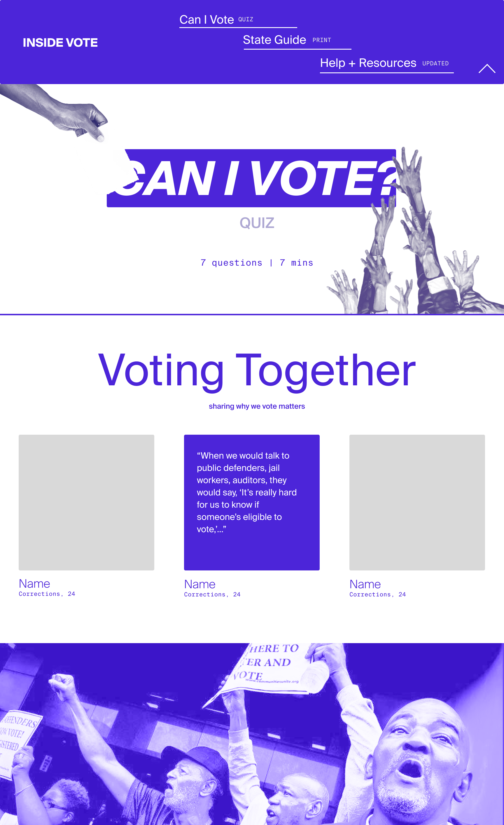
Inside Vote, increasing voting access for those incarcerated, formerly incarcerated, or justice-involved.

PROJECT SPACE
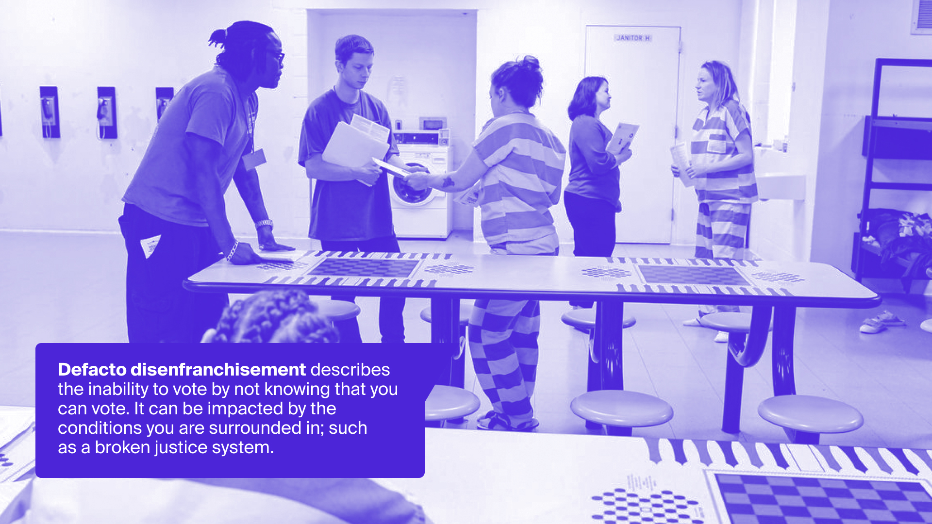
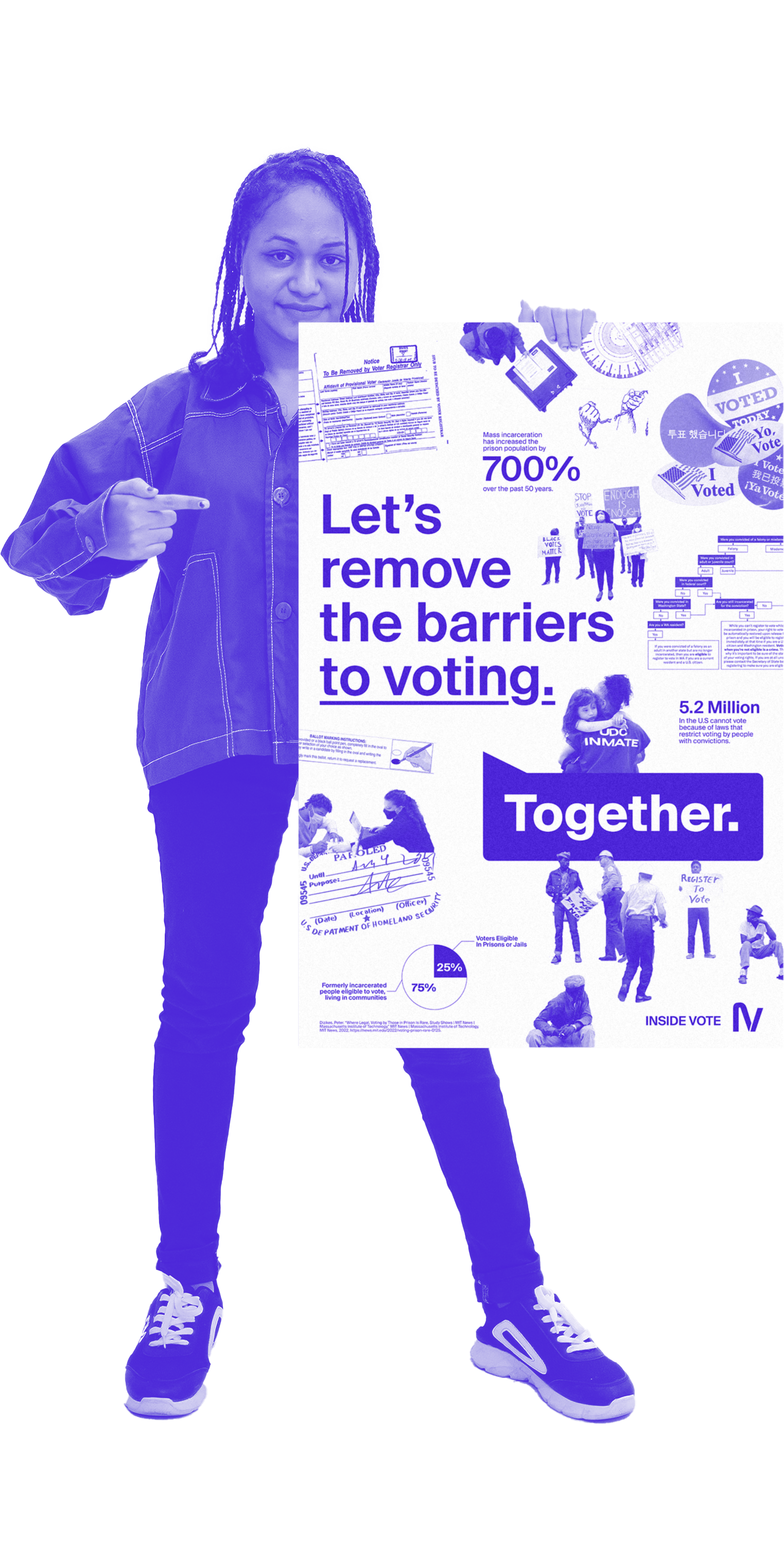
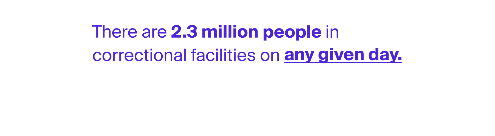
5.2 million people in the U.S. with convictions cannot vote because of restrictive voting laws.
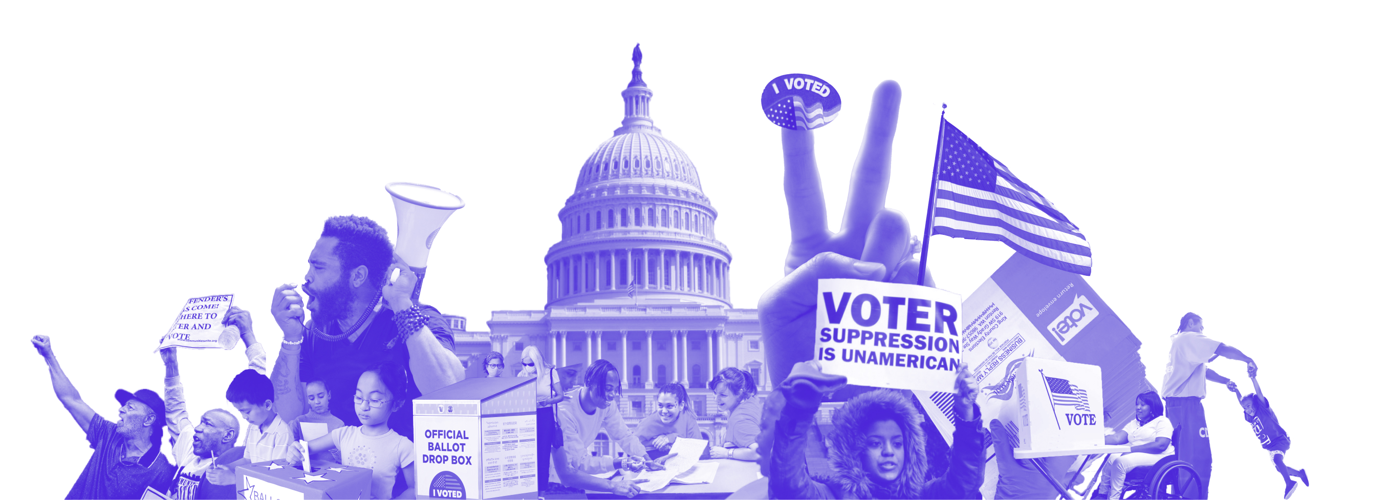
Our vote is our voice. The right to vote is the cornerstone of our democracy. Our country’s history is marked by successful struggles and legal battles to ensure that the right to vote is not a privilege reserved for the wealthy few, but a right guaranteed to all, regardless of race, class, or gender (ACLU WA). Due to eligibility confusion, registration barriers, and systemic injustice, 5.2 million people in the U.S. with convictions cannot vote because of restrictive voting laws.


MISSION
Empower and share resources with those who have experienced inside (and those who wish to advocate on the outside).
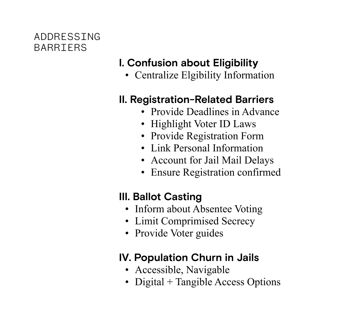
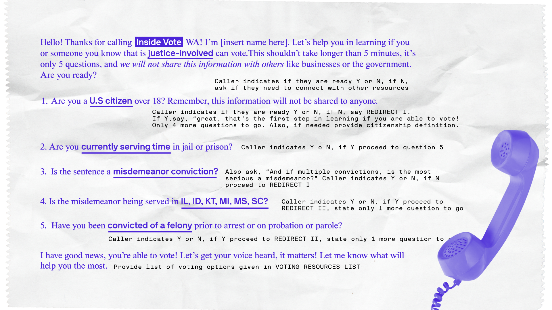
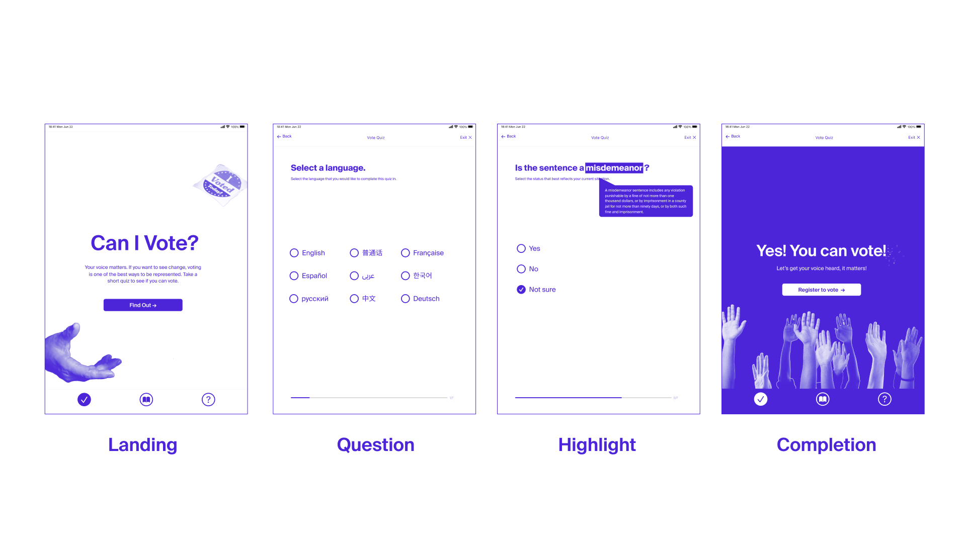
This project seeks to change voter disenfranchisement, by providing multiple ways to outreach to these voters. A voter eligibility quiz, help hotline, and state voters guide all work in concert to provide aid to voters “inside”. People who have experienced the inside understand the justice system firsthand and can reform the U.S. mass carceral state. Additionally, they can vote on initiatives that impact not only them but their children, family, and friends so we can reduce the likelihood of going back to prison.

CAMPAIGN
Negative connotations of those involved in the justice system are often the first things that come to mind when trying to dismantle prejudice within it. So, approaching this project with inclusive language that acknowledges humanity rather than a ostracizing status (i.e., referring to someone as incarcerated rather than a criminal) was important. Treating those with humanity and respect is the prioritized tone of the project.
Representation matters.
Negative connotations of those involved in the justice system are often the first things that come to mind when trying to dismantle prejudice within it. So, approaching this project with inclusive language that acknowledges humanity rather than a ostracizing status (i.e., referring to someone as incarcerated rather than a criminal) was important. Treating those with humanity and respect is the prioritized tone of the project.
IDENTITY
Navigable + identifiable. Using a visible purple + active annotations.
This project utilizes an annotational style to distill the most neccessary information down for a complex topic. The non-partisan purple monocolor palette also serves to ensure accessibility and identifiability.

TAKEAWAYS ︎︎︎
As a project that must navigate a complex, extremely prejudiced and politicized space understanding bias, acknowledging privilege and consulting with first person accounts was the main focus. The research, prototype, and application stages were frequently revisited to better help inform specific design decisions (ie. expanding language accessibility, respecting literacy levels and tone). Designing alongside formerly incarcerated individuals, their families, and community leaders that support them was such a meaningful experience.
Design with, not for others.
As a project that must navigate a complex, extremely prejudiced and politicized space understanding bias, acknowledging privilege and consulting with first person accounts was the main focus. The research, prototype, and application stages were frequently revisited to better help inform specific design decisions (ie. expanding language accessibility, respecting literacy levels and tone). Designing alongside formerly incarcerated individuals, their families, and community leaders that support them was such a meaningful experience.
EXPLORATION ︎
PROCESS, SKETCHES, MOODBOARDS, BRAIN DUMPS + MORE︎︎︎
![]()
![]()
![]()
![]()
![]()
PROCESS, SKETCHES, MOODBOARDS, BRAIN DUMPS + MORE︎︎︎